Dandelion Payments — Design System & Webflow Platform Foundation
Role: Product / Brand Designer (UX + UI)
Company: Dandelion Payments (Euronet Worldwide)
Timeline: 2024-2025
Tools: Figma, Webflow, GA4, Airtable/CSV automation, Python, splide.js
Team: Marketing, Network, Product, Data, Stakeholders across regions
Company: Dandelion Payments (Euronet Worldwide)
Timeline: 2024-2025
Tools: Figma, Webflow, GA4, Airtable/CSV automation, Python, splide.js
Team: Marketing, Network, Product, Data, Stakeholders across regions

Summary
Dandelion Payments needed a scalable way to ship consistent marketing and product-facing pages across regions, while keeping performance high and updates fast. I led the design system and page foundation work—aligning visual language, building reusable components, and improving the delivery workflow so teams could publish faster with fewer inconsistencies.
The problem
Dandelion’s web presence had grown organically, creating friction in three areas:
Inconsistency: Repeated patterns (CTAs, cards, forms, nav) were implemented differently across pages.
Slow updates: Shipping changes required rebuilding similar layouts multiple times.
Scale pressure: New initiatives (events pages, case studies, regional coverage content) increased demand, but there wasn’t a stable system to support it.
Goals
Create a reusable component foundation that keeps brand consistency without slowing delivery.
Improve UX clarity for B2B audiences (what we do, who it’s for, why it matters).
Reduce time-to-publish for common page types (case studies, events, high-traffic pages).
Support scalability across future content and regions.
My role
Designed and documented a component library (typography, layout grid, cards, buttons, nav, forms).
Built / refined Webflow implementations of the system (classes, structure, responsive rules).
Led UX improvements for key pages: navigation, CTAs, layout hierarchy, form UX, and trust elements.
Created repeatable templates for content types (case study pages, events pages, etc.).
Collaborated across Marketing + Network teams to keep design decisions aligned with business needs.
What I delivered
A practical design system (built for shipping)
Instead of a “perfect” theoretical system, I focused on a library that teams could reliably use in Webflow:
Type scale + spacing rules
Buttons + link patterns (primary/secondary/tertiary)
Cards (value props, region cards, case study blocks)
Layout modules (hero variants, split sections, toolbars, content grids)
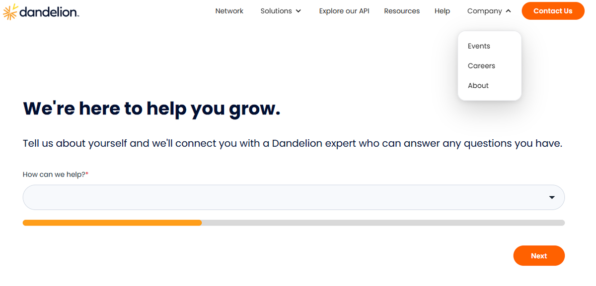
Form patterns (HubSpot embed styling, error states, loading states)
Outcome: fewer one-off implementations, faster page builds, consistent UI across the site.

Conversion-focused refinements (without breaking brand)
For high-traffic pages, I focused on conversion fundamentals:
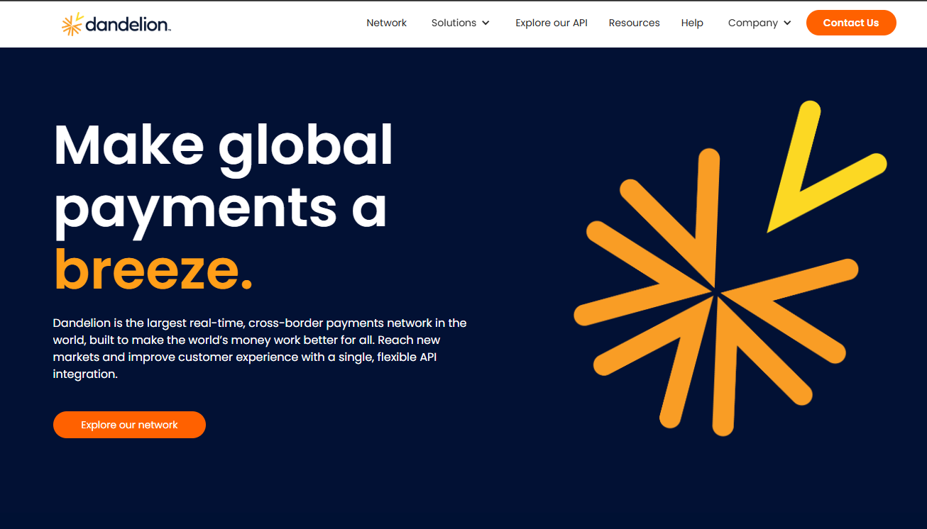
Cleaner hierarchy
Stronger first-screen clarity
Clear information about dandelion
Consistent trust placement (logos, proof points, testimonials if used)
Outcome: improved clarity + reduced cognitive load for first-time visitors.
Decision A — System over one-off
We stopped treating pages as individual designs and started treating them as a product surface.
That meant:
building reusable sections
locking the rules (spacing/typography)
making it easy to stay consistent
Decision B — Build for the editor
Webflow sites live or die based on how editable they are.
I prioritized:
Scalable class structure
Modules that can be rearranged safely
Responsiveness that doesn’t require manual patching
Decision C — B2B clarity wins
Instead of being overly clever visually, we optimized for:
Speed of understanding
Credibility
Direct pathways to action

Results
Reduced loading time of the site by 70%
Consistency: decreased UI deviations by consolidating patterns into a single system.
Leads through hubspot got classified instantly, improving qualified leads
Maintainability: faster iterations and fewer regressions when updating nav/CTAs/forms/carrousels.
Qualitative feedback: stakeholders reported improved clarity and easier content updates.
Strategic decisions: Improvements built around GA4 data.
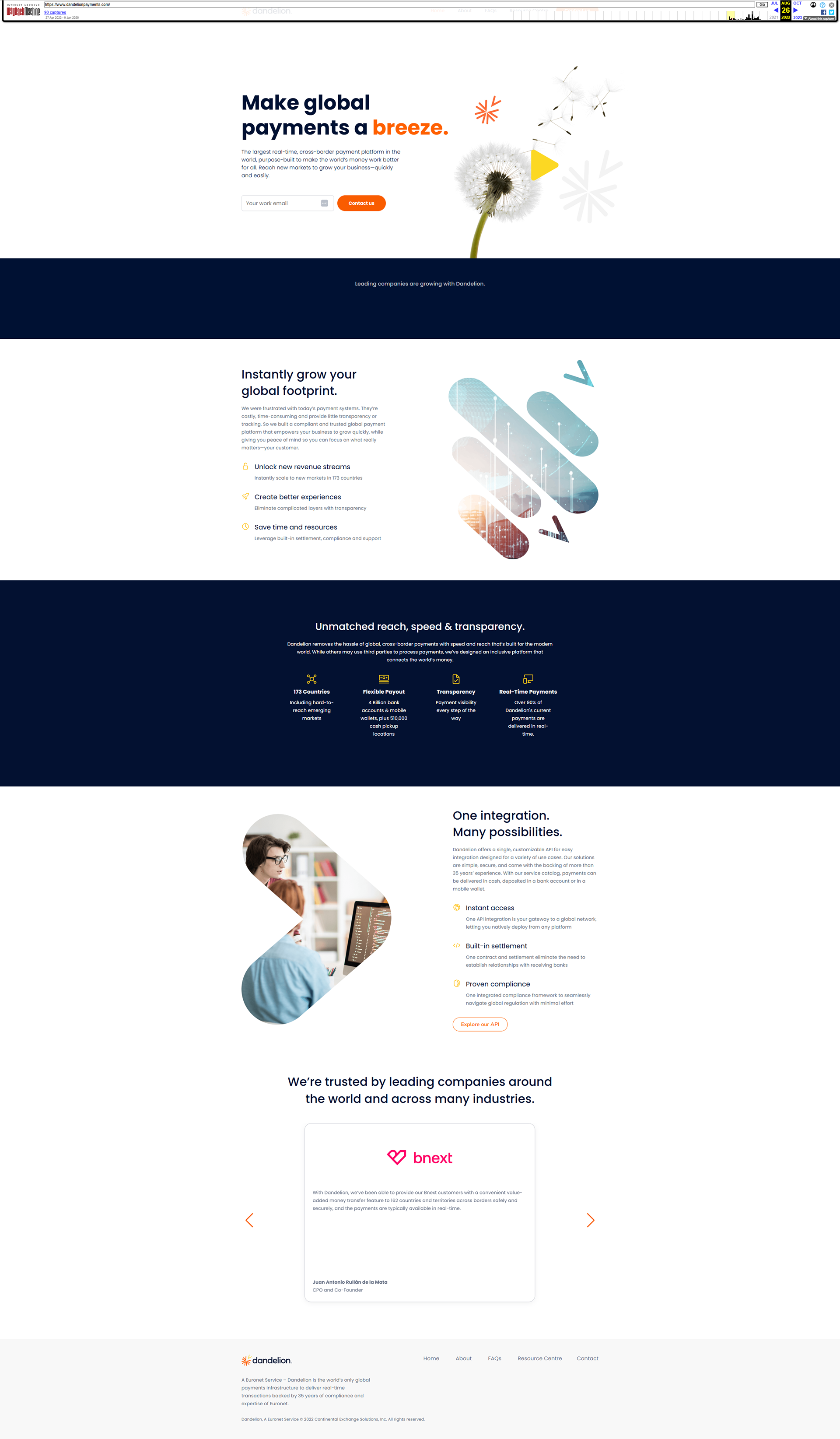
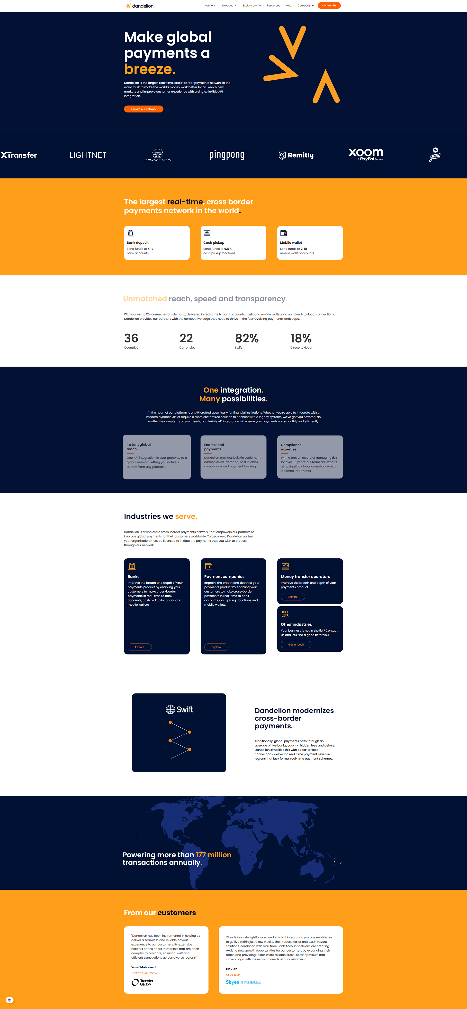
Old vs New Site