+20%
Qualified leads
73%
Page load time reduction
CMS
Ready to use
"The site had grown organically. Same patterns, built five different ways."
Dandelion Payments is a B2B cross-border payments platform operating across multiple regions. By 2024, the product was scaling fast — but the web infrastructure hadn't kept up. Pages were built in isolation, the brand was inconsistent, and any meaningful update required rebuilding work from scratch.
I was brought in to fix the foundation.
I was brought in to fix the foundation.
Research & Key Pain Points
My role
I owned this project end-to-end.From auditing the existing site and identifying the highest-impact gaps, to designing and building the system in Figma and Webflow, to defining the CRO strategy for high-traffic pages.
This wasn't a handoff project. I designed, built, tested, and iterated directly.
This wasn't a handoff project. I designed, built, tested, and iterated directly.
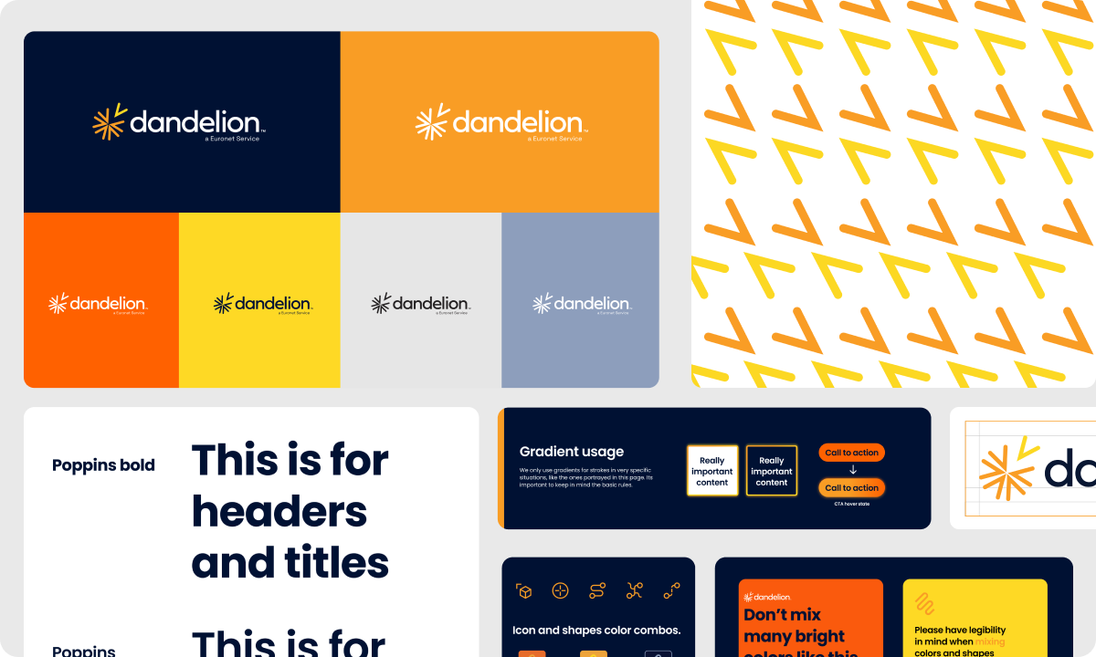
Design System
A design system made for shipping, not for documentation.Rather than a theoretical component library, I focused on what teams would actually use in Webflow day-to-day:
— Type scale and spacing rules
— Button and link patterns (primary / secondary / tertiary)
— Cards: value prop, region, case study blocks
— Layout modules: hero variants, split sections, content grids
— Form patterns: HubSpot embed, error states, loading states
The goal: staying consistent had to be easier than going off-system.
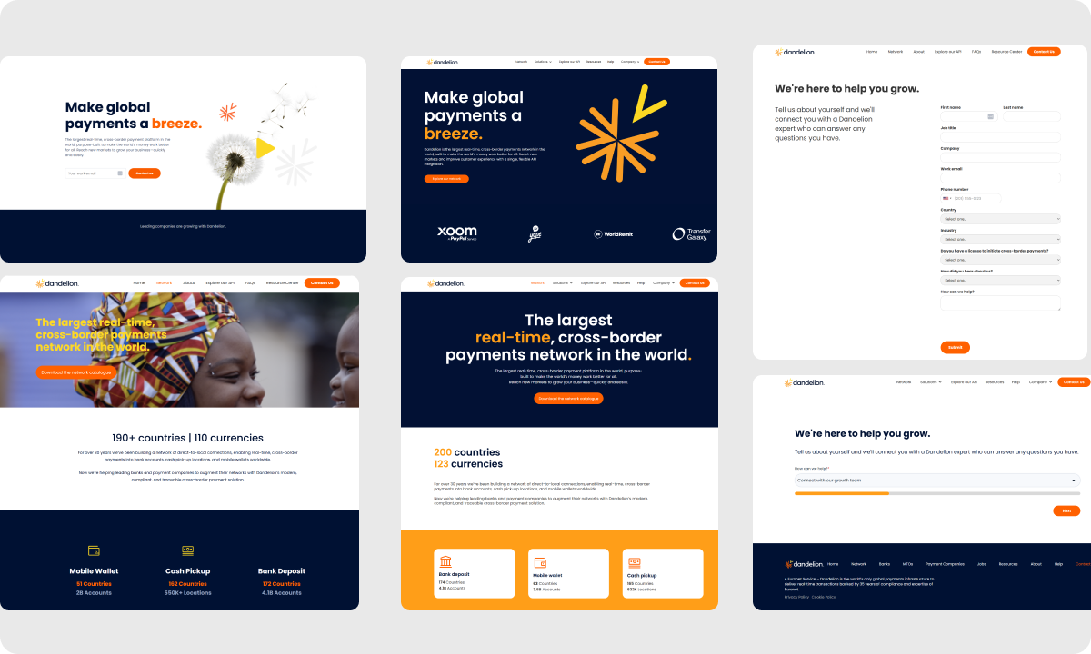
CRO
Conversion-focused page redesigns.
For high-traffic acquisition pages, I applied a focused CRO approach: audit with GA4 data, identify drop-off points, form hypotheses, test, iterate.
Focus areas:
— First-screen clarity: what Dandelion does, who it's for, what to do next — answered in under 5 seconds
— Trust placement: logos and proof points at hesitation moments
— Form UX: reduced friction in lead capture, improving HubSpot qualification rates
— CTA hierarchy: eliminated competing calls-to-action on key landing pages
Key decisions
01 — System over one-off
Every new page request created pressure to build something custom. I pushed back consistently — the goal was to absorb new content into the system, not expand the surface area of exceptions.
02 — Build for the editor
Webflow sites degrade fast when the class structure isn't built to scale. I prioritized a naming convention and modular structure that non-designers could update safely.
03 — B2B clarity wins
Dandelion's audience evaluates trust and capability, not aesthetics. Every visual decision was filtered through: does this make the value clearer and the path to action faster?
Results
+20% increase in qualified leads through improved acquisition flows and CRO on key landing pages.
70% reduction in page load time after rebuilding the Webflow structure and optimizing asset delivery.
Faster time-to-publish — what required rebuilding from scratch now ships from templates.
Better lead classification through HubSpot form optimization — sales team received better-qualified pipeline.